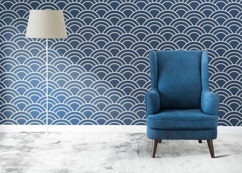
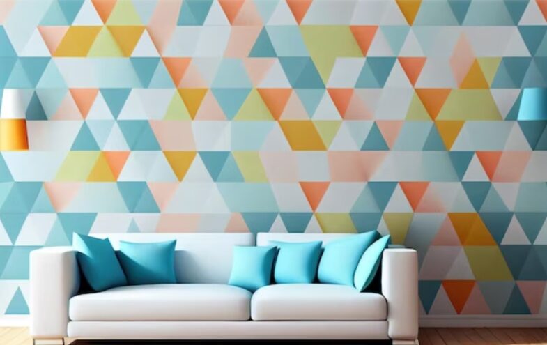
The interplay of colors and patterns in home décor transcends mere aesthetic appeal; it embodies the essence of balance and harmony within a space. Integrating varied hues and designs not only enriches the environment but also reflects the dwellers’ personalities.
This guide explores how to master this art, ensuring every room radiates with a cohesive and inviting atmosphere. Beyond the visual pleasure, this interplay serves to create an environment that nurtures well-being and resonates with the individuality of those who inhabit the space, making the art of decorating not just a task, but a journey towards personal and spatial harmony.
Quick Navigation
1. Understanding Color Theory
Color theory is fundamental in interior design, comprising primary (red, blue, yellow), secondary (green, orange, purple), and tertiary colors (mixtures of primary and secondary). Each color evokes specific emotions, influencing the room’s ambiance. Warm colors add vibrancy and energy, while cool tones offer calmness and serenity.
Recognizing these effects is crucial in creating a desired emotional impact in your home. Delving deeper, understanding the psychology behind colors can transform a mere room into a sanctuary, reflecting and even altering the mood and dynamics of the living space.
2. Establishing a Color Palette
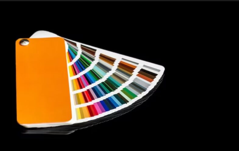
Selecting a color palette is a pivotal step in designing a space. It involves choosing a dominant color that dictates the mood, complemented by secondary and accent colors to enrich the palette. This hierarchy ensures a harmonious blend throughout the décor, guiding the selection of paints, furnishings, and accessories.
The dominant color serves as the foundation, enabling a cohesive design narrative. This foundational choice acts as the canvas on which your personal style narrative unfolds, setting the stage for a symphony of colors and patterns to dance in harmony.
To better establish a color palette check out outlets with few examples, for different types of furniture which you can find at https://rythmoftheworld.com/.
3. Start with Neutral Base
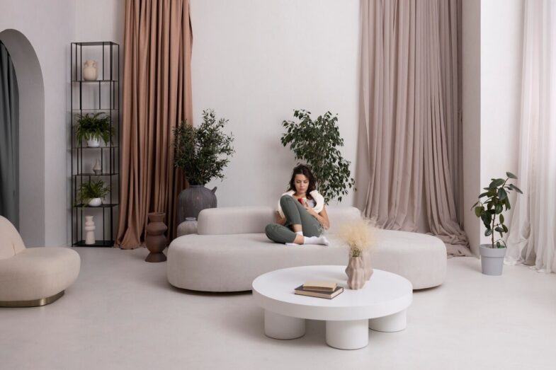
Neutral colors—beige, gray, white—serve as the perfect backdrop for any interior design scheme. They provide a versatile foundation, allowing for flexibility in mixing colors and patterns. Neutrals help in balancing vibrant elements, ensuring the space remains tranquil and grounded. Using neutral tones for walls and large furniture pieces simplifies the task of integrating dynamic accents later on. This approach not only establishes a sense of calm but also acts as a canvas, inviting you to paint your vibrant personality across your living space.
4. Adding Pop of Color
Introducing vibrant accent colors breathes life into a room, creating focal points and adding depth. These pops of color can come from various sources: throw pillows, artworks, or decorative items. This strategy enables easy updates to the interior’s look without significant overhauls, allowing the room to evolve with trends or personal preferences. This dynamic element encourages a playful interaction with space, allowing your home to evolve and resonate with the ever-changing tapestry of life.
5. Mixing Patterns
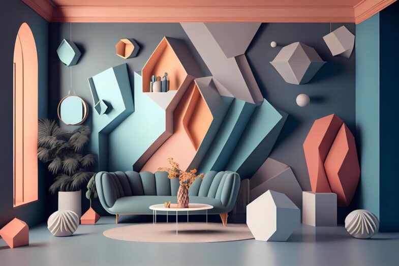
The art of blending different patterns—stripes, florals, geometrics—adds complexity and interest to any space. The key is in the balance of scale and contrast; large patterns should complement smaller ones, and bold patterns should be balanced with subtler designs. This variety creates a dynamic visual landscape, making the room visually appealing and engaging. The interplay of patterns acts as a visual symphony, creating a space that invites curiosity and celebrates complexity in harmony.
6. Coordinating Patterns
To successfully coordinate patterns, find a unifying element, such as a common color or theme. This connection ensures that despite the diversity of patterns, there’s a cohesive flow throughout the space. Examples include pairing different floral prints that share a similar color palette or combining geometric patterns with a common motif. This strategy maintains visual harmony while allowing for creative expression. It’s akin to composing a visual melody where each note, though different, contributes to a harmonious tune.
7. Using Texture Wisely
Texture plays a significant role in adding depth and dimension to a room. It can enhance the overall aesthetic through elements like rugs, curtains, and upholstery fabrics. Textured pieces invite touch and create a sense of warmth and comfort, making the space more inviting. Integrating various textures complements the color and pattern mix, enriching the room’s character. The tactile dimension of texture adds a layer of intimacy and comfort, inviting not just the eyes but also the touch to engage and connect with the space.
8. Maintaining Balance
While mixing colors and patterns, maintaining balance is paramount. It’s crucial to avoid overcrowding or overwhelming the space with too many competing elements. Achieving equilibrium involves thoughtful placement and proportion of patterns and colors, ensuring each component contributes to a harmonious whole. This balance fosters a cohesive and pleasant environment. It’s about creating a visual rhythm that dances between excitement and calmness, ensuring a space that’s vibrant yet peaceful, dynamic yet serene.
9. Creating Focal Points
Creating focal points using bold colors or distinctive patterns draws attention and structures the room. These can be an accent wall, a statement piece of furniture, or an art piece. Focal points serve as anchors, adding interest and guiding the viewer’s gaze through the room, enhancing the overall design narrative. They act as the storyline of your space, guiding the visual journey and anchoring the narrative in moments of visual intrigue.
10. Personalization and Trends
Incorporating personal style into home décor ensures the space truly reflects its inhabitants. While trends offer inspiration, personal taste dictates the ultimate choice of colors and patterns. Embracing current trends can invigorate a space, but it’s the personal touches that imbue it with life and character. Your home becomes a canvas reflecting your journey, stories, and dreams, making it more than just a living space, but a personal narrative in itself.
Conclusion
Mastering the mix of colors and patterns in home décor opens up a world of creative possibilities. By understanding color theory, establishing a balanced palette, and thoughtfully integrating patterns and textures, any space can be transformed into a harmonious and inviting haven.
Remember, the key is balance and personal expression—don’t be afraid to experiment and have fun with your home’s design. The ultimate goal is to create a space that not only looks aesthetically pleasing but also resonates with the essence of those who dwell within, making each home a unique masterpiece of personal expression and harmony.
💚💙💜 Do you know the colorful gadgets below are the most popular gifts on Amazon? The easiest way to brighten anyone’s day is by adding some bright colors to the environment. Inspired? Click the images below to explore!❤️💙💜
